
2002 Charts Center: British GP
By Michele Lostia, Italy
Atlas F1 Assistant Editor
Atlas F1 Assistant Editor
They say a picture is worth a thousand words. Well, what about numbers? The Atlas F1 Charts Center is a collection of graphs aimed at providing a visual representation of the drivers' and teams' performance throughout the Formula One season. So if you want to know who's up and who's down, it doesn't get clearer than that
Chart I: The following chart shows the actual difference in distance travelled based on the circuit's lap length and the best time each driver has set in qualifying. Drivers outside the 107% are excluded.
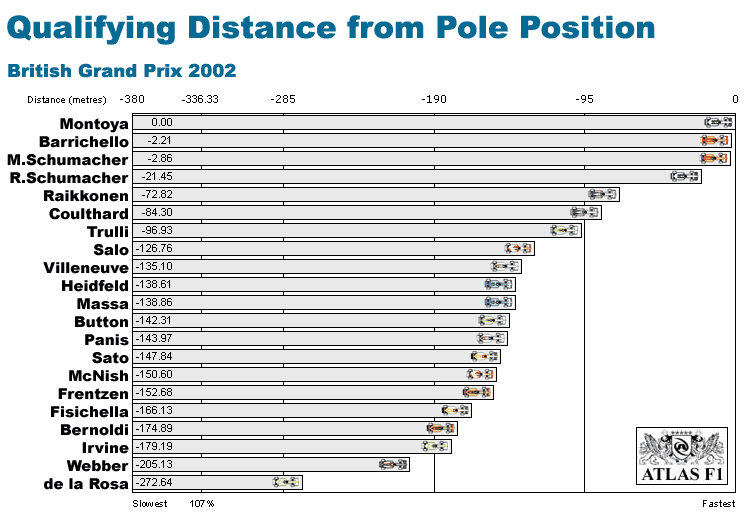
Chart II: The following chart shows how much further the GP winner travelled, in the time needed to take the checkered flag, compared to the other drivers. Drivers that were classified without finishing the GP, are shown with a clash icon, and are included based on their last lap. Therefore, their position in this chart does not reflect their final classification.
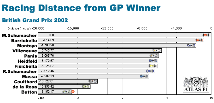
Chart III: The following chart shows the average qualifying position for each driver this season.
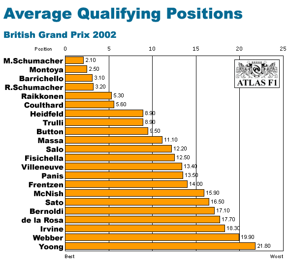
Chart IV: The following chart shows the average finishing position for each driver this season.
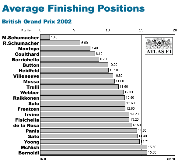
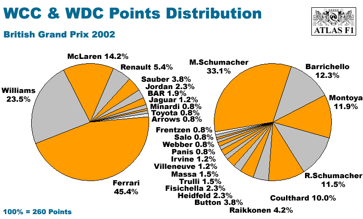
Chart V: The following chart shows how the World Championship points are distributed among the drivers and the teams this season.
© 2007 autosport.com
. This service is provided under the Atlas F1 terms and conditions.
Please Contact Us for permission to republish this or any other material from Atlas F1.
Please Contact Us for permission to republish this or any other material from Atlas F1.