| ATLAS F1 Volume 6, Issue 51 | |||
 |
Graphic Examples | ||
| by Karl Ludvigsen, England | |||
 Formula One cars are often referred to as advertising billboards on wheels. Putting mockery aside, the colour & visual design of racing cars has become a mastery in the past thirty years, since sponsorship has entered Formula One. Award winning Karl Ludvigsen reviews some of the 2000 season cars - the good, the bad and the very ugly Formula One cars are often referred to as advertising billboards on wheels. Putting mockery aside, the colour & visual design of racing cars has become a mastery in the past thirty years, since sponsorship has entered Formula One. Award winning Karl Ludvigsen reviews some of the 2000 season cars - the good, the bad and the very ugly
Industrial designer Raymond Loewy was a huge fan of auto racing. The famous designer of the post-war Studebakers was also behind some of the greatest icons of our times, such as the Coke bottle and another one I'll tell you about. A Frenchman who had found a home in America, the suave, mustachioed Loewy was invariably on hand at Le Mans for the 24-hour race. He had some stunning specially-built private cars on Lincoln, BMW and Lancia chassis. I was privileged to meet him and make a small contribution to one of his projects.
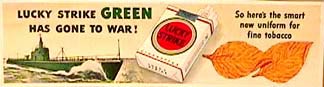
No longer with us, Loewy would have loved the 2000-season BAR cars. Their bold graphics, and that of their team members, is just outstanding. The team has a huge visual impact. Those graphics are based on the work of Loewy and his team. Back before mid-century Raymond Loewy was asked by the makers of Lucky Strike cigarettes to revamp their image. Their pack had the bold bullseye we see today but against a green background. Loewy swept that away and proposed a clean white backing instead, a fresher look that has survived to this day. And he delivered a bonus to their makers, who could say that they'd given up the green paint to the war effort, which used a lot of it. Their slogan: "Lucky Strike green has gone to war".
Pushing the corporate identity at an auto race makes no sense. People aren't at the track or watching on the tube to get excited about a corporation. They are watching because they are interested in cars, not companies. It would have made much more sense to promote "Chrysler" or especially "Mercedes-Benz". When I asked a friend at the company about it he was as nonplussed as I. "Probably a decision someone in the States made on his own," he thought.
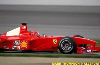
I was also surprised to see that in "Marlboro country" there was absolutely no Marlboro identity on the Ferraris. They and every member of the team were crudely expunged of any sign of the brand name of this major sponsor for the race at Indy. The reason couldn't be local television restrictions; we have plenty of visible tobacco sponsorship in the American CART series.
So what was the reason for the whiteout? I'm reliably informed that it was the result of a binding agreement between the US Attorney General and the American tobacco companies to the effect that they can only sponsor an entrant in one racing series. For Philip Morris's Marlboro brand, that's their sponsorship of Team Penske in CART. As far as the Attorney General's office was considered, here clearly was another series, even if it was just invading America for one race.
We have some good graphics in Formula One, but nothing to match the incredible designs that Stefan Becker creates for the Mercedes-Benz GT and DTM cars. His becker design company in Nieder-Olm, near Frankfurt, has been responsible for the graphics schemes that make cars look as if their sheet metal has been ripped away to reveal the machinery underneath – an incredible tour de force of design.
Of course in Formula One no designer wants Stefan Becker to give away his secrets, but just a taste of Becker-style creativity would be welcome in a field whose cars are beginning to look more like billboards than racing cars. I'm sure Raymond Loewy would approve.
|
 I got to thinking about team graphics late in the 2000 season. We had plenty of time to admire the BAR look during the race in Japan, where the director gave us lots of angles of Jacques's Honda-powered car. The Indy race threw up a few anomalies. One was that over the McLaren garages and around the circuit we saw quite a few big white-on-black "DaimlerChrysler" signs.
| Karl Ludvigsen | © 2000 Kaizar.Com, Incorporated. |
| Send comments to: ludvigsen@atlasf1.com | Terms & Conditions |